Exhibition UMBAU. Nonstop Transformation // April 10 - May 5, 2025 - Jiushi Art Salon Shanghai
Chao Hotel Beijing in a New Cloak
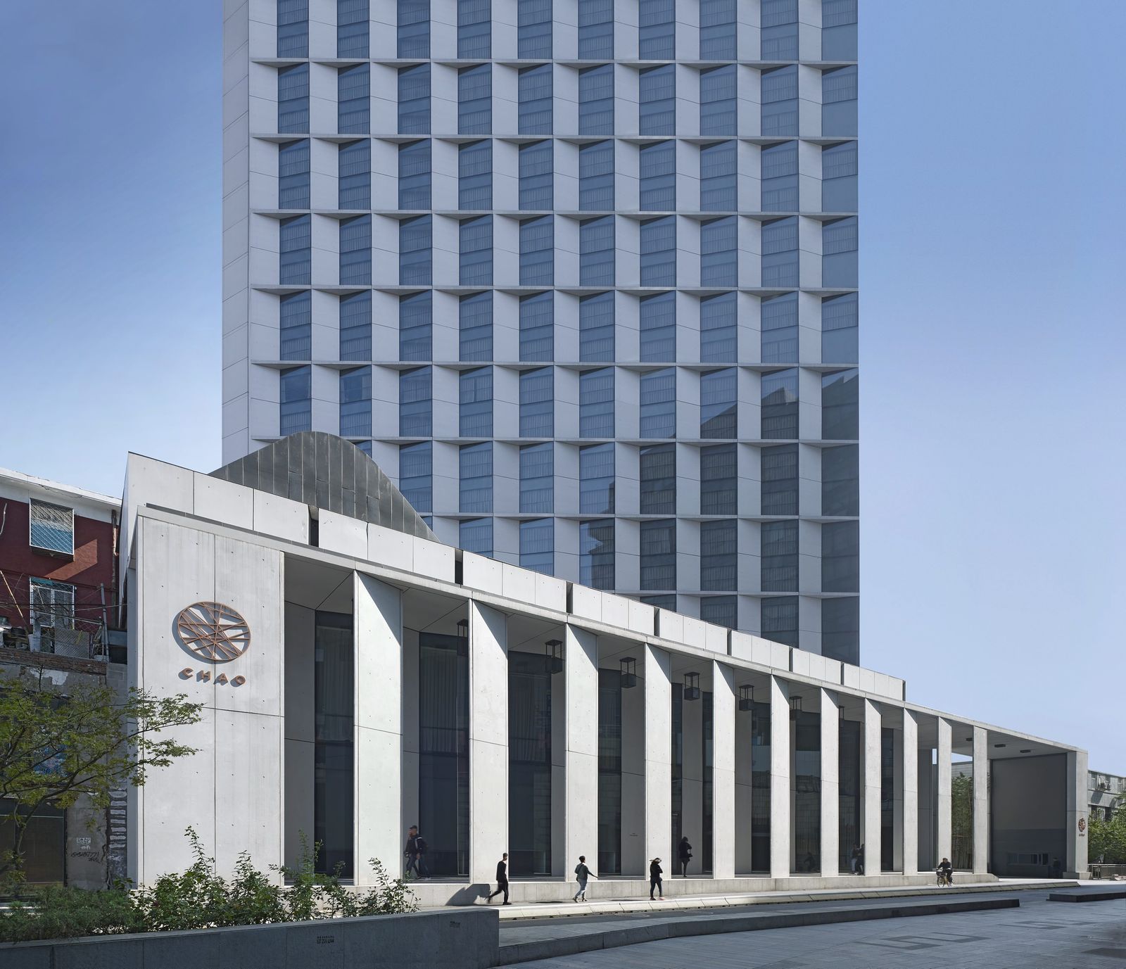
The new facade by von Gerkan, Marg and Partners Architects (gmp) imparts a lightness and a sculptural effect to the modernized hotel tower, which can be seen from afar. Its angled vertical elements and the alternating closed and glazed panels create a play of light and shadow. Horizontal ledges are inserted every two stories, thus creating a calm facade geometry with balanced proportions. In addition to the external envelope, gmp designed the multifunctional “Glasshouse” to add a venue with a special atmosphere to the hotel complex. Since its modernization and reopening in 2016, the 80-meter-high hotel tower is one of the popular destinations in the Sanlitun business quarter of Beijing. The former “Beijing City Hotel” was created in 1990 as China began to open up. The former appearance of the building and its scant relationship with the urban design context were a result of Beijing’s fast urbanization process. The design by gmp represents a contemporary and yet long-term functional hotel architecture that reestablishes the position of the tower in the urban context.
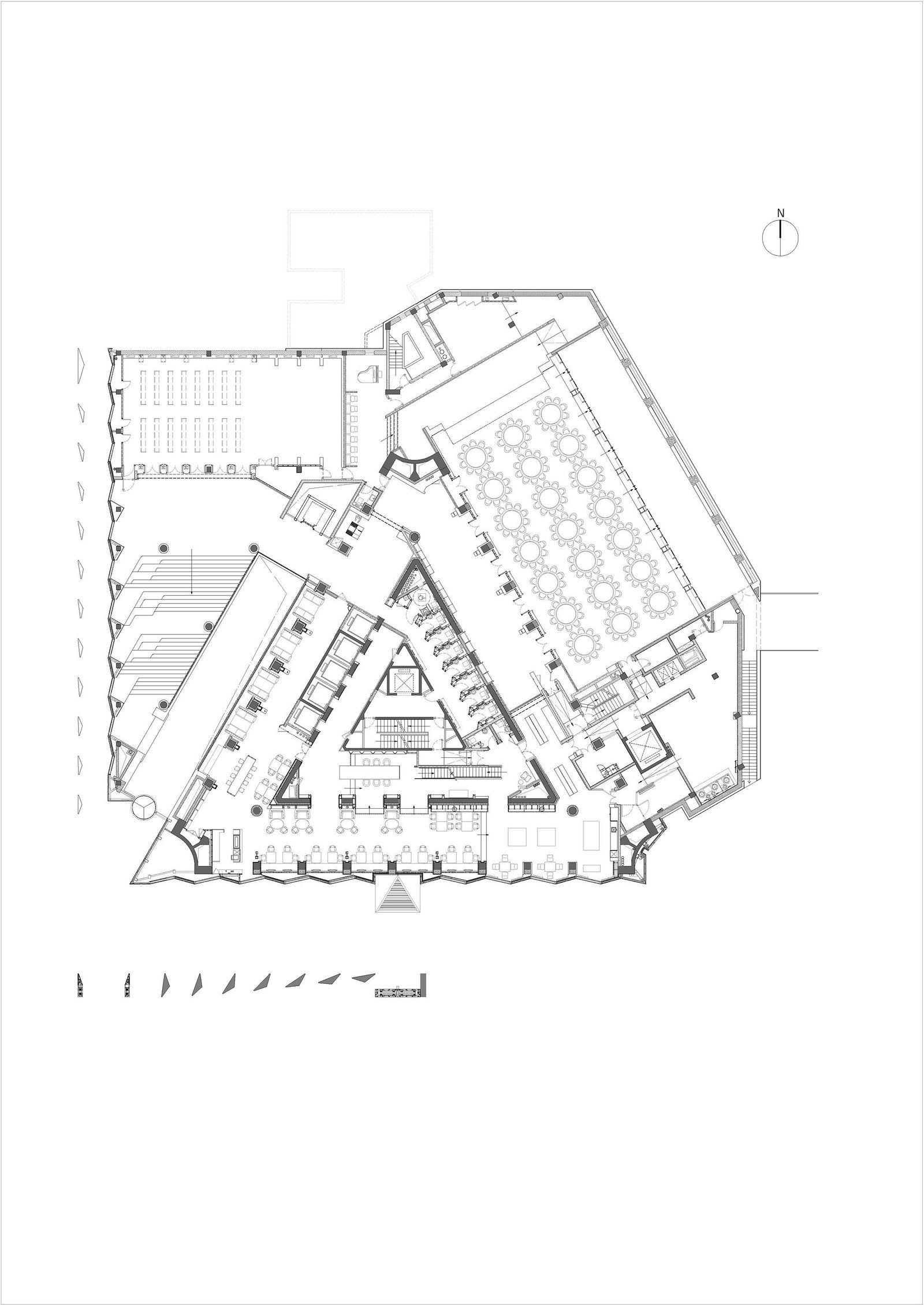
The three-dimensional zig-zag-like building envelope reflects the triangular footprint of the 26-story tower and reinforces the recognizability of the building. Curtain-wall elements in light gray glass-fiber concrete alternate with gray-tinted glass panels and the angled arrangement of these panels and elements means that, depending on the viewing angle, the sides of the building appear to change between open and closed. Slender horizontal ledges made of glass-fiber concrete have been inserted every other story, thus creating a harmonious rhythmic division of the facade. The geometric arrangement and the story-high glazing opens the formerly introverted building to the surrounding urban space and creates a new spatial quality in the hotel rooms.
The materials and structure of the high-rise facade continue in the new extended entrance area of the hotel. A colonnade on the west and south sides of the building consisting of ten-meter-high glass-fiber concrete elements visually defines the entrance and screens the semi-public forecourt to the south of the hotel. The vertical panels with triangular cross-sections are positioned at different angles, which has the effect of guiding hotel guests intuitively from the noisy Workers’ Stadium North Road to the recessed, formerly very hidden, hotel entrance.
Likewise, the venue modernized by gmp and now called “Glasshouse” reflects the clear geometry of the facade design. Supported by an arched structure, a double-skin roof with an external layer of glazing and internal louvers admits daylight into the space below, which has aptly been named “Glasshouse”. The louvers function as solar screening devices, softening the natural light, and as a means of attenuating sound. The interplay of colors of the concrete arches and wooden louvers in combination with the play of light and shadow create a nearly spiritual atmosphere in the space below.


